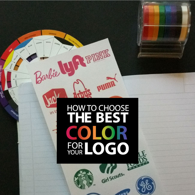
Choosing colors for your brand is a crucial decision. Not only will the colors appear on all your marketing materials, throughout your website and on your packaging; it will also subconsciously communicate with your customers. The colors you select for your logo will affect the feeling and mood associated with your brand. Several studies also conclude that up to 90% of snap judgments made about products may be based on color alone. Yeah, it’s that deep.
Color psychology plays a key role in marketing and branding. Its a tool that can be used strategically to solidify the message you want your brand to communicate to customers. While colors can mean different things depending on culture or industry, here are a few universal color meanings:

PINK
Pink is a calm and non-threatening color. It’s a color that’s been proven to alleviate feelings of anger and aggression. When used in lighter shades it is associated with feminine traits and works well for products and services geared toward women. More intense shades of pink convey youthfulness, fun and energy.

RED
Red is a color that evokes a response. It is energetic, attention-grabbing and provocative. It energizes the physical senses which make it a popular choice for athletic brands. Red is also proven to quickly stimulate the appetite which is why it is frequently used in fast food branding.

ORANGE
Orange communicates cheerfulness, exuberance, fun and enthusiasm. It’s an appealing color for brands that are youthful or creative. It is also effective at evoking feelings of energy and vitality for businesses in the healthcare sector. Softer shades of orange may work well for salons, spas and upscale brands.

YELLOW
Yellow is a sunny optimistic color that causes people to take notice. Eyes are drawn to yellow before any other color which makes it a good choice to use for point-of-purchase displays and sale items. Yellow is also a color that encourages motion. Fast food restaurants often use it in combination with red to stimulate the appetites of patrons, encourage them to eat quickly, and then to move on and make room for new customers.

GREEN
Green has a clear association with nature – growth, health, vitality and freshness are characteristics associated with this color. Darker shades of green often relate to prestige, money or wealth. Lighter shades of green are effective for communicating feelings of calmness or serenity.

BLUE
Blue is one of the most universally used colors. It is perceived as dependable, trustworthy and solid. It is a popular color for electronic brands. Darker shades of blue are dominant color in the financial industry, political organizations and law firms where trust and reliability is important. Lighter shades of blue are tranquil and calming; they relate well to the travel industry and health & wellness businesses.

PURPLE
Purple is a great color for communicating luxury or creativity. Medium shades of purple inspire intellectual thought and achievement, while darker shades denote sophistication or premium status. Lighter tones of purple evoke nostalgia and work well for branding sentimental items.

BROWN
Brown is an earthy color that consumers associate with practicality, reliability and stability. Brown has a clear connection to chocolate and is a popular brand color for chocolatiers. Medium shades of brown are often used in branding for wholesome food or agriculture products. Deeper shades of brown communicate sophistication and professionalism.

BLACK & METALLICS
Black and metallic shades are bold, powerful and classic. They are commonly used for upscale products since the connote drama, sophistication and quality. Silver and gold are associated with prestige and wealth. These colors are often accented by black – a color that strongly communicates luxury, power and control.
Hopefully, that quick guide gives you a starting place for selecting the core color for your brand or logo. I recommend working with a skilled designer to navigate through the more complex issues of combining colors, selecting the right shades and adding other design elements (fonts, shapes, etc.) to solidifying your branding.
FOLLOW ME


 Multi-faceted Designer, Creative Director & Founder of SCOTCHBONNET! Accessories